YouTube thumbnail mistakes that kill your CTR
Eight common YouTube thumbnail mistakes, what to do instead, YouTube's current thumbnail specs and how to check a design before you publish.

8 min read
Most people decide whether to watch from a small picture and a line of text. Here are eight thumbnail mistakes, what to do instead and how to check yours before you publish.
The before and after examples below are illustrations we wrote to show each idea. They aren't real test results.
1. Is there too much text on the thumbnail?
A thumbnail isn't a second title. Every extra word gets smaller, and at phone size small words disappear. YouTube's Thumbnail & title tips say: "If you add text, make sure to use a font that's easy to read."
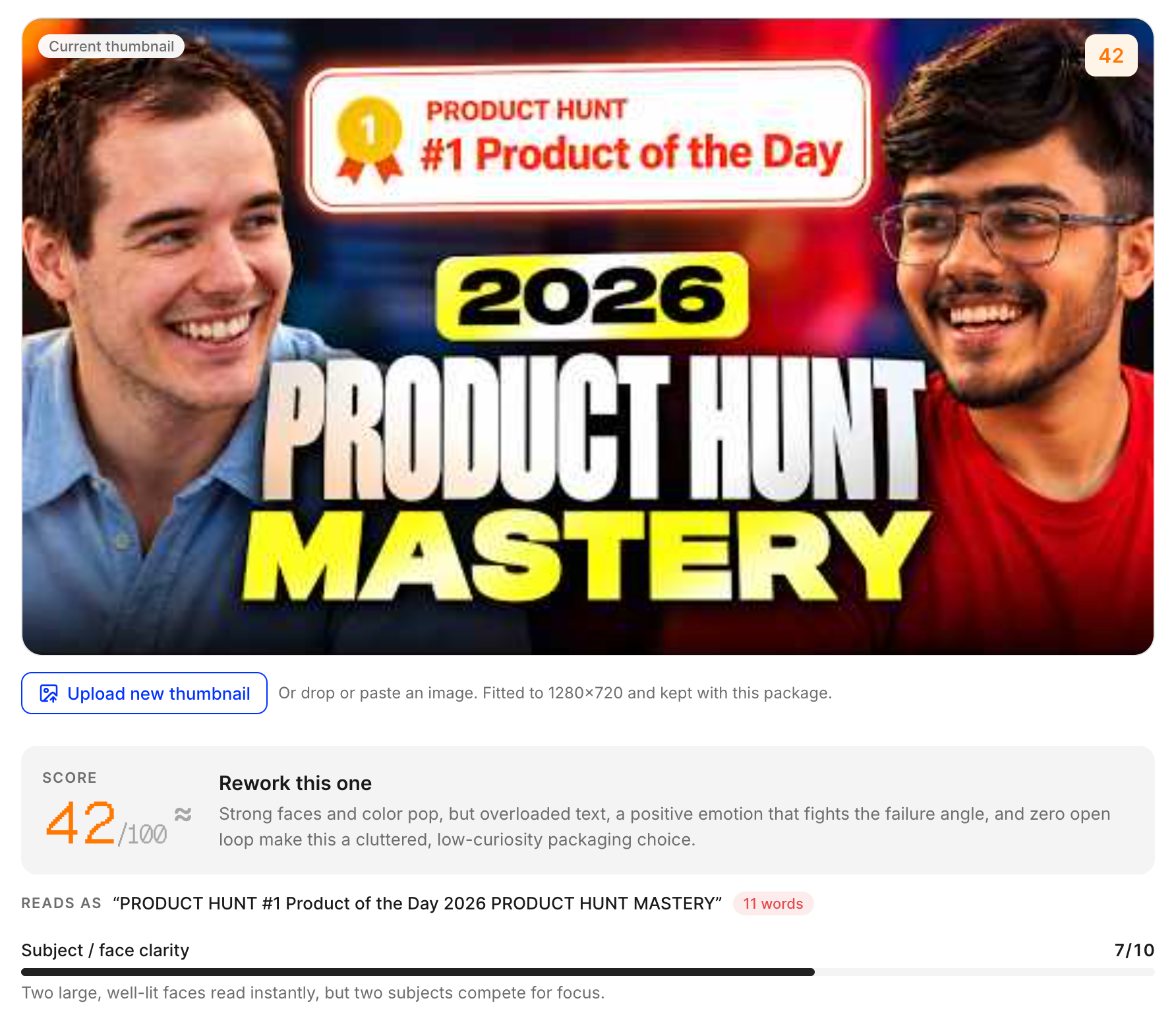
Do instead: use a few large, bold words, or none if the picture tells the story. Vid0's AI critique counts the words it can read and treats 4 or fewer as ideal, 5 or 6 as worth trimming and more than that as a problem. That's Vid0's rule of thumb, not a YouTube rule.
Illustration. Before: "MY HONEST REVIEW OF THE NEW BUDGET LAPTOP AFTER 30 DAYS" across the top. After: the laptop with a cracked hinge and "30 DAYS LATER" in three big words.
2. Does it still work at phone size?
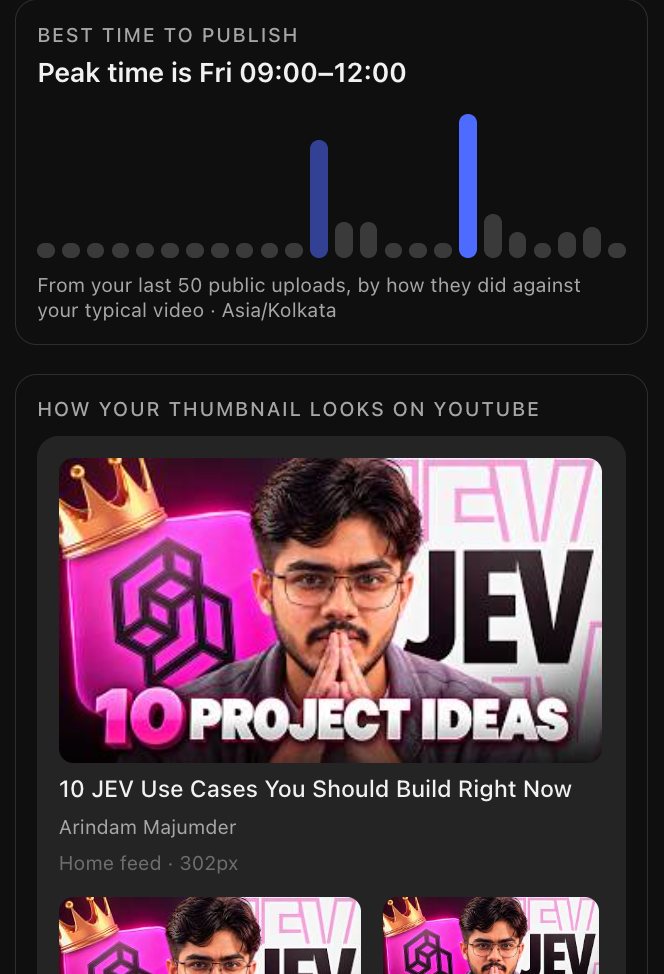
YouTube's tips warn that "thumbnails show up differently across devices", and some sizes are tiny. Fine details, thin fonts and small faces that look great on your monitor blur together in the up-next column.
Do instead: shrink it before you publish. Look at it at about the size of a thumbnail in the up-next list, then squint. If you can't tell what it is, the subject needs to be bigger and the contrast stronger.
The Vid0 extension shows this inside YouTube Studio, under "How your thumbnail looks on YouTube":
3. Is the contrast too flat, or the image too dark or too bright?
If the subject and background are close in brightness, nothing stands out. A very dark thumbnail sinks into dark mode, and a very bright one blends into YouTube's white background in light mode.
Do instead: light the subject, darken or blur the background, and add one saturated colour. Then look at it on both a light and a dark background.
Vid0's Thumbnail lab runs these checks in your browser, with no AI, the moment you add an image:
| Check | What it measures | When it warns |
|---|---|---|
| Brightness | Average brightness | Under 20% (very dark) or over 82% (very bright) is flagged red. Under 33% or over 70% gets a softer warning |
| Contrast | How far light and dark areas differ | Low contrast reads as "Flat" |
| Colour pop | How colourful the image is | Nearly greyscale, or muted with no strong accent |
| Clutter | How much fine detail there is | "Busy" when too many details compete |
| At small size | What contrast survives at 168×94 | Under 40 out of 100 "turns to mush", 40 to 59 is borderline |
| Size | Width, height and shape | Not 16:9, or under 640 pixels wide. A softer note under 1280×720 |
Scroll sideways to see every column.
Those numbers add up to an instant score out of 100, weighted towards contrast and readability at small size. It's a heuristic, not a prediction of clicks.
4. Is the design too busy?
Too many objects, arrows and logos compete for the same glance. YouTube's tips say "Try not to make the design too complex" and that colour and composition "can help catch the eye, but too much can overwhelm it".
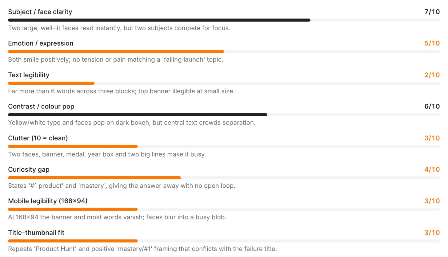
Do instead: pick one subject and one idea. Cut everything that doesn't support it, or blur the background behind the subject. YouTube also suggests the "rule of thirds" to place the subject.
5. Does the thumbnail just repeat the title?
If the title says "I tested 7 headphones under $50" and the thumbnail says "7 HEADPHONES UNDER $50", the viewer reads the same thing twice and learns nothing new.
Do instead: make the title and thumbnail add up to more than either alone. Let the picture show what the title can't say.
Illustration. Before: seven headphones in a row with "7 HEADPHONES UNDER $50". After: one pair circled in red with "ONLY ONE?", next to the same title.
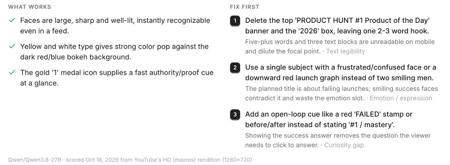
Vid0's AI critique scores this as "Title–thumbnail fit", one of the eight things it rates from 0 to 10 along with subject clarity, emotion, text legibility, contrast, clutter, curiosity and legibility at 168×94. It also reads out the words it can see on the thumbnail and lists the three fixes worth making first. One critique uses one AI action (see pricing for each plan's allowance). For the title side, use the 6-point YouTube title checklist.
6. Is something important hidden in the bottom-right corner?
YouTube puts the video length in the bottom-right corner of most thumbnails, on top of your image. Text, a face or a product placed there can end up covered.
Do instead: keep key text and faces away from that corner. Vid0's feed previews show the length badge in place.
7. Is the file the wrong size or shape?
YouTube's Add custom thumbnails page, as of October 2026, sets these requirements for video thumbnails:
- A resolution of 3840 × 2160 pixels, with a minimum width of 640 pixels
- Image formats such as JPG or PNG
- Under 2 MB when uploading from a phone, and under 50 MB on a computer
- An aspect ratio of 16:9
You can only upload a custom thumbnail once your account is verified. Shorts thumbnails are different: YouTube recommends 9:16, at 2160 × 3840 pixels.
Do instead: design at 16:9, export as large as your tools allow and keep it well inside the size limit, especially if you upload from your phone.
8. Does the thumbnail promise something the video doesn't deliver?
A shocking thumbnail can win the click and lose the viewer. YouTube's Impressions & click-through-rate FAQs say: "You can tell if your thumbnail is clickbait if it's getting high CTR but low average view duration", and that such videos "are less likely to get recommended by YouTube".
Do instead: show something that really happens in the video, ideally early. Check CTR and average view duration together after publishing. What is a good CTR on YouTube? explains how to read your CTR against your own channel's usual.
How do I test which thumbnail works better?
Two ways, and they answer slightly different questions.
On your own videos: YouTube's Test & Compare. According to YouTube's A/B test titles & thumbnails page, you can test up to three titles and/or thumbnails on a video from YouTube Studio on a computer. Shorts and videos that are private, made for kids or for mature audiences can't be tested. The winner is the version with the most watch time, not the highest CTR, and tests should finish within two weeks. YouTube's tips also recommend "experimenting with updating older thumbnails".
Before you publish: compare in a real feed. Vid0's Thumbnail lab takes up to three variants and the title, and drops them into a mock YouTube feed next to real videos from the channels you track or a keyword you choose. You can switch between home, search, up next and mobile, light and dark, and shuffle where your video sits. The images stay in your browser unless you ask for an AI critique.
After publishing, Vid0 also scores the thumbnails on your existing uploads, so you can spot old videos worth repackaging:
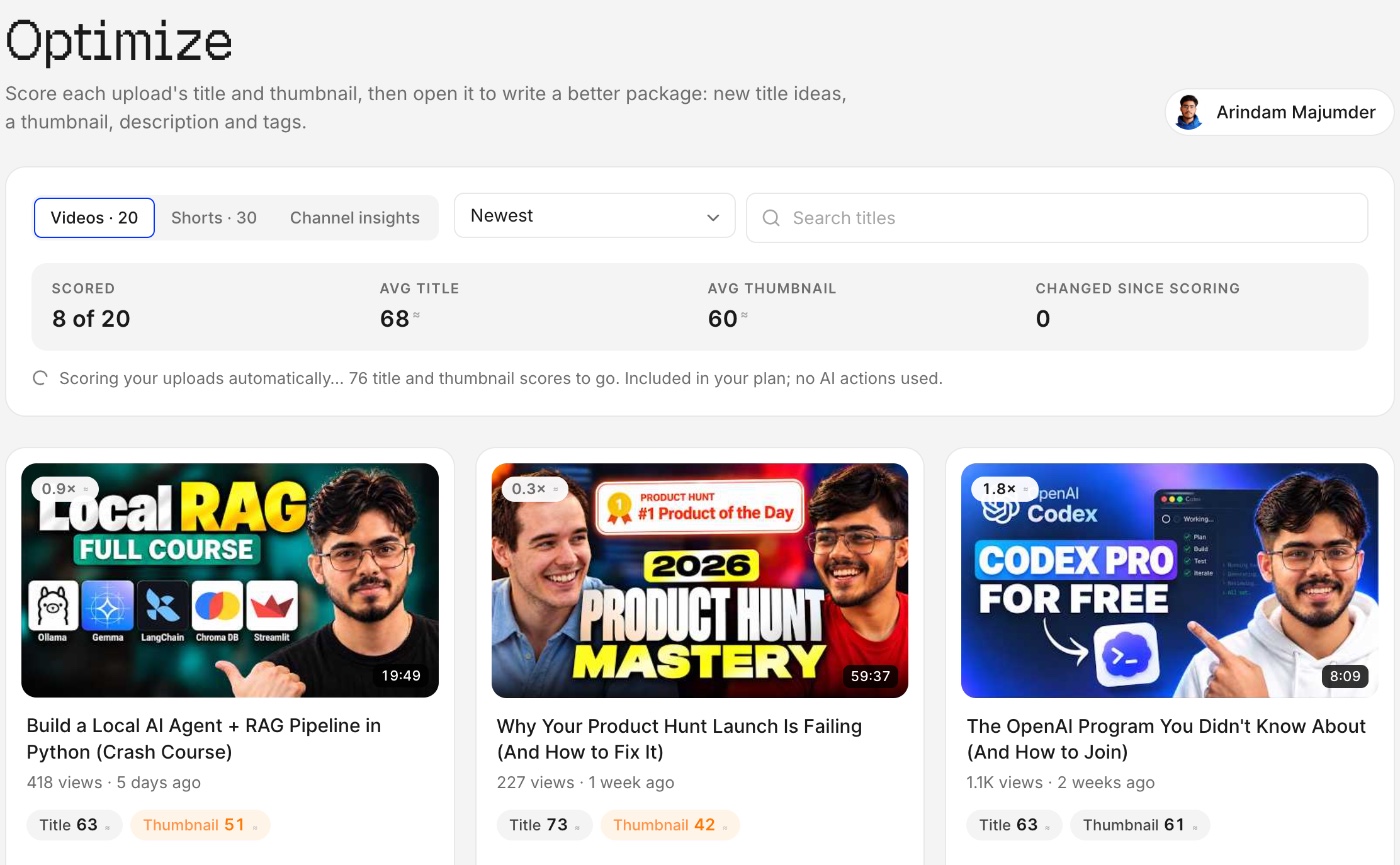
If you do swap a thumbnail, the Vid0 extension's scorecard keeps a change history for the videos Vid0 tracks. It compares average views per hour over up to 48 hours before and after each title or thumbnail change. What is views per hour (VPH)? explains how to read that number.
FAQ
What size should a YouTube thumbnail be?
YouTube currently asks for 3840 × 2160 pixels at 16:9, with a minimum width of 640 pixels, as JPG or PNG. The file must be under 2 MB from a phone or 50 MB from a computer.
How many words should a YouTube thumbnail have?
As few as possible. Vid0 treats 4 or fewer large words as ideal and more than 6 as a problem. Many good thumbnails have no text at all.
Does YouTube's Test & Compare pick the thumbnail with the most clicks?
No. It picks the version with the most watch time. A thumbnail that gets more clicks but loses viewers early can lose the test.
Should I change the thumbnail on old videos?
YouTube recommends experimenting with it. Test & Compare is the safest way: YouTube says all the variations "are shown to viewers at the same time", so you're not comparing different weeks.
Create your creator profile today
Your stats, rates and past collabs on one link, like vid0.in/@yourchannel. Share it with brands and get booked.
Keep reading
All posts →- GrowthResearch
How to get your first 1,000 YouTube subscribers
Ten steps for new channels. Learn from channels your size, package before you film, win the first 30 seconds and judge every upload against your usual.
8 min read
- PackagingAnalytics
What is a good CTR on YouTube? (And how to judge yours)
YouTube says half of channels and videos sit between 2% and 10% CTR. Why niche benchmarks don't hold up, and how to judge CTR against your own channel.
7 min read
- PackagingTitles
How to write YouTube titles that get clicked: a 6-point checklist
The six things Vid0 checks in every YouTube title, from curiosity to the first 40 characters, with good and bad examples for each.
5 min read
Find your next outlier
Vid0 shows which videos broke out in your niche, why they did, and what you could make next.